Sig 3 - Abstract?

Zex

Senior Member
Joined
Aug 15, 2009
Posts
2,483
Bells
1,973
For a friend, blah blah blah.

He wants to change his name to Lars (only god knows why) so thats what I put on there.

Once again, made very quickly. This is not my true work or full potential. I consider this a fragment of my signature making.

But anyywayssss, C&C? I'd say this is abstract, because I was too lazy to add a render.

V1
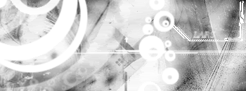
lars.gif


V2 - Made it a little more emotional, IMO

LARSV2.gif


V3 - Ocean Feel. Im done playing around with this sig now.

LARSV3.gif


Edit - And I like V3 the best, for anyone who cares.
 
I think V3 looks best, V2 looks kinda bad.
 
Master Crash said:
I think V3 looks best, V2 looks kinda bad.
Overall thoughts? What should I work on?

You make excellent sigs, and I need some ways to get better. :p
 
Zexion said:
Master Crash said:
I think V3 looks best, V2 looks kinda bad.
Overall thoughts? What should I work on?

You make excellent sigs, and I need some ways to get better. :p
Not that i can think of.

I can't really think straight seeing as i just chugged 3 cups of Mountain Dew @____@
 
Master Crash said:
Zexion said:
Master Crash said:
I think V3 looks best, V2 looks kinda bad.
Overall thoughts? What should I work on?

You make excellent sigs, and I need some ways to get better. :p
Not that i can think of.

I can't really think straight seeing as i just chugged 3 cups of Mountain Dew @____@
Haha, ok. Thanks anyways.
 
It's fine, but keep in mind that even abstract signatures need depth or flow. V3 has better contrast which makes it cleaner.
 
Nikoking said:
It's fine, but keep in mind that even abstract signatures need depth or flow. V3 has better contrast which makes it cleaner.
Haha thanks. Ill be sure to try another when I have more time on my hands.
<big>
<small><small>not when my stupid friend is like "come on lets go play wii!"</small></small></big>
 
V1 and V2 are pretty meh.

V3 really expanded on it with color, and made it infinitely better. It's a very simple tag at a glance, but when you look closer you see a lot more detail.

It is very good and you're well on your way. Keep it up, man.
 
How do you do that? Did you use Photoshop.
Did you make the render yourself? If so, how?

V1 and V3 are awsome, V2 is too red.
 
Oo, do you use that JJ?
Do you have to be insane on computers to do that, or could I do because I'm only good on Photoshop?
 
Back
Top