You are using an out of date browser. It may not display this or other websites correctly.
You should upgrade or use an alternative browser.
You should upgrade or use an alternative browser.
Sporge's gallery
- Thread starter Sporge27
- Start date
Sporge27
Retired Staff


Oh definitely agree.Gengar said:Sporge, as much as I try, you win the Gimp sig making award.
")
I'm starting to think sig-making is a bit too addicting...maybe like, unhealthy addicting.
If I have trouble getting a job as a game designer, I can always make graphics for internet sites.


Sporge27
Retired Staff
That is the edge filter, I make the text that blue, then ad black lines through it, in this case I used a lightning brush. I just love that black mage guy.Gengar said:I love the Pikmin one!
How do you get the text to be like that on the Black Mage one?
Sonicdude41
Senior Member
I like it Sporge!! What's the code to put it in my sig?

Grawr
Retired Staff

Hang on, is there text in that sig?SPORGE27 said: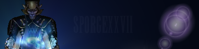
Ugg in this one I need to work on a little, I found a cool way to have the text but something else is missing, what do you guys think?
It's good otherwise, I like the lighting. But maybe if somethin' else could be happening in the middle...
Sporge27
Retired Staff
Yeah the lighting should be stronger to make the text appear more...It looked better on Gimp to be honestGengar said:Hang on, is there text in that sig?SPORGE27 said:
Ugg in this one I need to work on a little, I found a cool way to have the text but something else is missing, what do you guys think?
It's good otherwise, I like the lighting. But maybe if somethin' else could be happening in the middle...

Sporge27
Retired Staff
I don't know, to be honest my favorite is that Gengar one still, that was practically perfect in my opinion. this one is great, I love how I have the one form of vaati and then my own creation of the wind form he had. The font I used fits it decently too, so it looks fantastic.Gengar said:The new one's your best ever.
I think I am getting better, less randomness to my methods.
Grawr
Retired Staff
Nah, I think you showed your best work on this one. Like you said, less randomness. What filters did you use?SPORGE27 said:I don't know, to be honest my favorite is that Gengar one still, that was practically perfect in my opinion. this one is great, I love how I have the one form of vaati and then my own creation of the wind form he had. The font I used fits it decently too, so it looks fantastic.Gengar said:The new one's your best ever.
I think I am getting better, less randomness to my methods.
Sporge27
Retired Staff
3 layers, top has the render and the text, middle contains a brush I collected that is the bright purple, flooded the one section red and added a black dot to make the eye, then used a fractal brush in black lightly over it, used the edge filter.
For the bottom layer, that is the light purple used a brush that looked cool on a black background whirled it a little and viola, bonito.
For the bottom layer, that is the light purple used a brush that looked cool on a black background whirled it a little and viola, bonito.

Grawr
Retired Staff
Jeez....they keep on getting better!
My current one, I got a lot of good comments on...so I don't know if I want to make a new one...incase its worse.
I just need to figure out how to download cool fonts from "dafonts.com" and make them pop up into GIMP!!!
My current one, I got a lot of good comments on...so I don't know if I want to make a new one...incase its worse.
I just need to figure out how to download cool fonts from "dafonts.com" and make them pop up into GIMP!!!
Similar threads
- Replies
- 1
- Views
- 56