You are using an out of date browser. It may not display this or other websites correctly.
You should upgrade or use an alternative browser.
You should upgrade or use an alternative browser.
`Jason's Gallery`
- Thread starter Jas0n
- Start date
Awesome text. I think i agree, it turned out wellJas0n said:^ Cry at no comments on my last sig.
Anyway, yay for double post.. New sig:
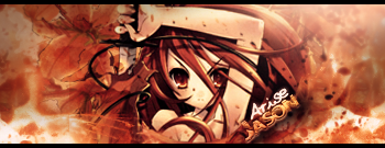
Tried a new technique on this well, quite pleased with how it turned out
Facepalm at my spelling mistake that I didn't realise until now. How do I mistake "well" for "one" xDThunderstruck said:Awesome text. I think i agree, it turned out wellJas0n said:^ Cry at no comments on my last sig.
Anyway, yay for double post.. New sig:

Tried a new technique on this well, quite pleased with how it turned out

Anyway, I love the text too, I think this is the first text I've done that actually looks really good.
Lol, i didn't even notice. Comparing this text to your other ones, the others seem way too basic.Jas0n said:Facepalm at my spelling mistake that I didn't realise until now. How do I mistake "well" for "one" xDThunderstruck said:Awesome text. I think i agree, it turned out wellJas0n said:^ Cry at no comments on my last sig.
Anyway, yay for double post.. New sig:

Tried a new technique on this well, quite pleased with how it turned out

Anyway, I love the text too, I think this is the first text I've done that actually looks really good.
Text is something I've wanted to perfect for a long time, but it's a whole thing of its own. The generic text like in my most recent signature doesn't fit in with my normal signatures because it distracts from the render too much. I'm still trying to find a style of text that works with those "blendy" style sigs, hence why a lot of it is just basic white text to avoid people stealing them.Thunderstruck said:Lol, i didn't even notice. Comparing this text to your other ones, the others seem way too basic.Jas0n said:Facepalm at my spelling mistake that I didn't realise until now. How do I mistake "well" for "one" xDThunderstruck said:Awesome text. I think i agree, it turned out wellJas0n said:^ Cry at no comments on my last sig.
Anyway, yay for double post.. New sig:

Tried a new technique on this well, quite pleased with how it turned out

Anyway, I love the text too, I think this is the first text I've done that actually looks really good.
Ohh, i see, i see.Jas0n said:Text is something I've wanted to perfect for a long time, but it's a whole thing of its own. The generic text like in my most recent signature doesn't fit in with my normal signatures because it distracts from the render too much. I'm still trying to find a style of text that works with those "blendy" style sigs, hence why a lot of it is just basic white text to avoid people stealing them.Thunderstruck said:Lol, i didn't even notice. Comparing this text to your other ones, the others seem way too basic.Jas0n said:Facepalm at my spelling mistake that I didn't realise until now. How do I mistake "well" for "one" xDThunderstruck said:Quoting limited to 4 levels deep
Anyway, I love the text too, I think this is the first text I've done that actually looks really good.
crazyredd45
DJ. Atomika
The siggy looks cool
Not sure if anyone's seen, but there was this girl on the X Factor last Saturday who kept pulling strange faces during her act. The video can be seen here:
<object type='application/x-shockwave-flash' width="250" height="250" data='http://www.youtube.com/v/JglWZ-wC3Vk'>
<param name='AllowScriptAccess' value='never' />
<param name='wmode' value='transparent' />
<param name='movie' value='http://www.youtube.com/v/JglWZ-wC3Vk' /><param name='play' value='true' />
<param name='loop' value='true' /><param name='quality' value='high' /></object>
For the lols I made an animation of her from an interview she had recently xD

crazyredd45
DJ. Atomika
Pretty cool
crazyredd45
DJ. Atomika
Awesome
That's gorgeous, but I think you should have made a little more contrast around the tigers back paws. It would have stood out a little more and not blended in so much with the background. The key to black and white (or relatively two tone in your case) images is contrast.
Yea I noticed the same thing, I was originally aiming for a foggy effect around the legs of the tiger but when I added the adjustment layers and such it seemed to just blend in too much.Zr388 said:That's gorgeous, but I think you should have made a little more contrast around the tigers back paws. It would have stood out a little more and not blended in so much with the background. The key to black and white (or relatively two tone in your case) images is contrast.
Thanks for the feedback nonetheless.
crazyredd45
DJ. Atomika
I think the fog idea worked
you colud deapen the colour , but don't listen to me
you colud deapen the colour , but don't listen to me
Lisathegreat!
Senior Member
Jason, OM*G.
I love how your pics look so glowing and bright, you feel as if you are there.
Keep it up!
I love how your pics look so glowing and bright, you feel as if you are there.
Keep it up!
I agree, I enjoy looking back on all my work to see where I've improved. It's also nice because sometimes I get inspired by things I've done in the past and I'm able to do redo them with better ability now.Sporge27 said:I really like a lot of your stuff here. It is also cool seeing how you've improved, no?
Thanks for comments aswell Lisa ^_^
D
Deleted User
mmmmmmmmmmm mmmmmmmmmmmmmmmm sexy! Hows about me and you meet up one night so you can show me more of your "art work"
1234gamefreak1
Member
these and really REALLY good sigs
Similar threads
- Replies
- 18
- Views
- 932
